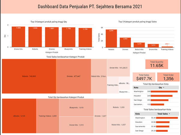
Looker Studio
Sales Report Dashboard PT.Sejahtera Bersama
 Tools : PostgreeSQL
 Data visualization : Looker Studio
 Background :
 The company was struggling to understand their sales trends across various branches and products. I helped them overcome this by establishing a data mart, analyzing the data, and building a dynamic dashboard. This provided actionable insights, leading to targeted sales strategies and increased revenue.
 Objective : Gather insights total sales from Product, Branch location, Month.
 Insight :
 1. The number of Robot Kits product categories has been increased due to the data showing that Robot Kits product categories are entering the top 5 sales. This means that there is more interest in Robot Kits product categories compared to Blueprints product categories.
 2. In the top 5 sales chart, the Robots product category has the highest sales compared to the others. It would be better to add more Robots product categories.
 3. Since the Training Videos product category is at the bottom of the top 5, with sales figures far from the other top 5 categories, it is better to reduce the number of Training Videos product categories.
Python
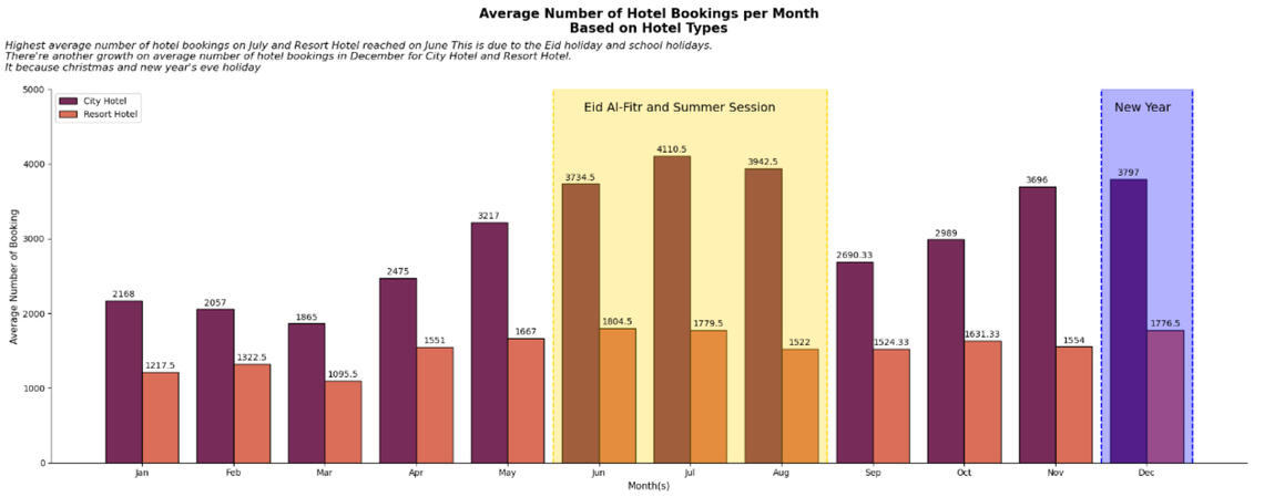
Investigate Hotel Business using Data Visualization
 Tools : Python(Google Collaboration)
 Library : Pandas, Matplotlib, Seaborn
 Background:
 In this instance, we will delve deeper into the hospitality industry. Our focus is to understand how our customers behave when making hotel reservations and its correlation with the hotel reservation cancellation rate. The insights we discover will be presented in the form of data visualization to make them more easily comprehensible and persuasive.
 Insight:
 The average number of hotel bookings in July is the highest, while the average number of bookings for resort hotels is highest in June. This is due to the Eid al-Fitr holidays and school holidays. There is also an average increase in the number of hotel bookings in December for both city hotels and resort hotels. This is due to the Christmas holidays and New Year's Eve.
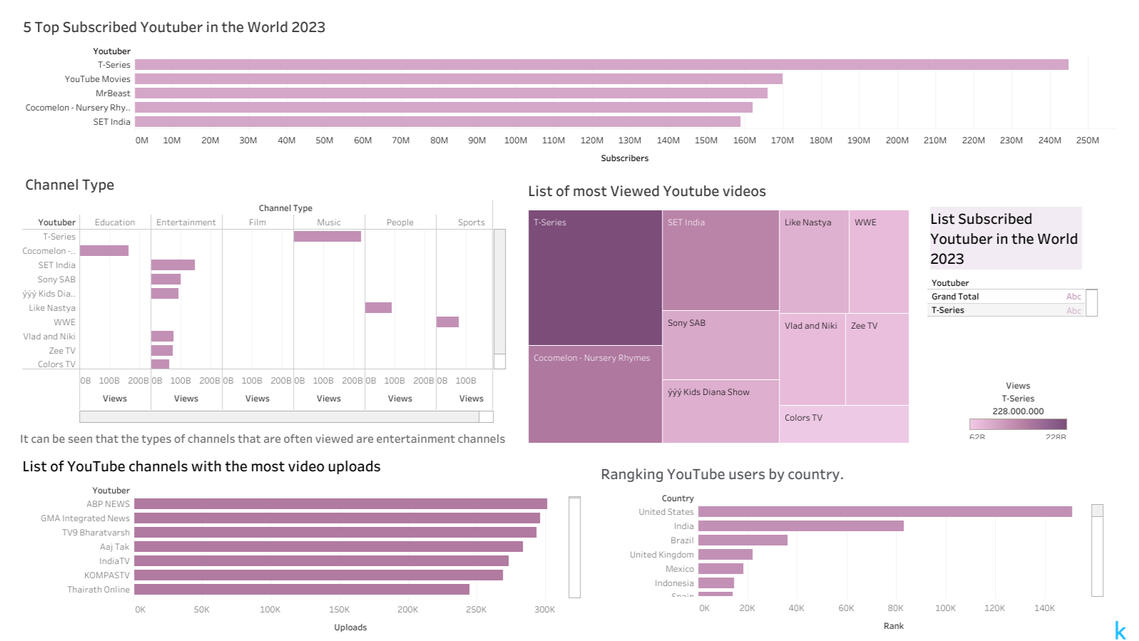
Tableau
Videos of Popular On YouTube
Data visualization : Tableau
 Background :
 we has a challenge, which is to do an analysis on YouTube to determine which videos are the most popular in 2023.
 Insight :
 Chanel of T-Series is the most views and subscribers on YouTube in 2023.
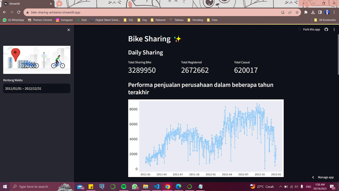
Streamlit
Bike Sharing
 Data visualization : Streamlit
 Tools : Python(VScode)
 Library : Pandas, Matplotlib, Seaborn, Numpy
Data visualization : Streamlit
Tools : Python(VScode)
Library : Pandas, Matplotlib, Seaborn, Numpy
 Background :
 The analysis can be used to understand factors that influence demand for bicycles. These factors include weather, business hours, and local customs. For example, if the weather is nice, people may be more likely to rent bicycles for recreational activities. If the business hours are limited, people may be less likely to rent bicycles. And if local customs discourage the use of bicycles, people may be less likely to rent bicycles.
 Insight :
 There are a few possible explanations for this trend. One possibility is that people are more likely to rent bicycles for leisure activities, such as commuting or going for a ride. These activities are more likely to take place during the day, when people are free from work or school.
Another possibility is that people are more likely to rent bicycles when the weather is good. In the afternoon, the weather is typically warmer and sunnier than it is in the morning or at night. This makes it more pleasant to be outside and ride a bicycle.